How might we help RV drivers safely get to their destination?

RV Way Map page

Project background

8 Weeks

2 UX designers
5 Full-stack web developers
3 Data scientists

Build-on project

The Big RV Picture

Motorhomes, RVs, campervans are all-purpose vehicles that take you where you want to go and give you a place to stay along the way. Recreational vehicles or RVs for short, represent adventure, the open road, and independence. In the U.S. they are getting more and more popular as these vehicles start to come with more modern conveniences.

When I started working on the project, I knew very little about the RV industry since RVs are not common where I grew up. My first impression was that this was a very niche market. The trends and statistics that I’ve gathered from the RV Industry Association (rvia.org) were eye-opening.

People travelling in an RV in the U.S.

25 million people a year

10 million full-time RVers

Typical RV Traveler

Married and 48 yrs. old

Annual income of $68,000

Trends in RV ownership from 2015-2018

2.32% increase in ages 35-44

3.07% increase in ages 25-34

User Experience Audit

The existing app is intended to generate a route that is safe for RVs after users input their vehicle’s specification but the core functionality which is the navigation was broken. The user interface was also not intuitive. It wasn’t clear what the user was supposed to do first when they get to the map page. Navigating the app can be confusing and overall, the existing solution was just not usable.

How Might We...

It became clear that we would have to totally redesign the user interface. Overhauling a product’s entire UI in 8 weeks or less is no small feat. Knowing that improvement is a never-ending process and to keep ourselves on track, we focused on the following goals:

  • Provide the most efficient and safe route for users who drive their RV's around
  • Give users the most accurate intel based on their details and preferences
  • Continuously improve the routing function through additional data sources and crowd-sourced data
  • Provide users with a simple and beautiful app design to yield a better RV traveling experience

My partner and I wanted to engage our entire team in our process early on. This not only helped build camaraderie, but it also helped our developers and data scientists understand what we, as UX designers, were contributing to the team. They were so excited when we asked them to join us for a brainstorming workshop!

During this workshop, we worked as a team to create initial survey questions, and asked how might we achieve our goals?

Mobile screens of low-fidelity wireframes

Customer Interviews: learning about their painpoints and needs

Talking to our target users was very insightful, we learned a wealth of invaluable information. To understand what problems we need to to address, one of the main question we asked was:

How are the needs of a person driving an RV different from someone who drives a regular vehicle?

We learned that people driving an RV think about things that wouldn’t normally be a concern for a person driving a regular vehicle. We went through all the responses and organized it into painpoints and wants.

PAINPOINTS

  • Low clearances
  • Bumpy roads
  • Dangerous intersections
  • Gas stations that do/don't have diesel
  • Steep grades
  • Lack of on/off ramp warnings
  • Narrow city streets
  • Not enough information about stops that accomodates RVs

WANTS

  • Points of interest
  • Parking lots
  • Offline usage
  • Gas stations that accomodate RVs
  • Live traffic update
  • Saving routes
  • Campground information
  • Avoiding tolls
  • Clean showers/restroom locator
  • Gas prices
  • Crowd-sourced information

The first solution is not always the best solution

Based on the user’s painpoints and wants, we designed an initial solution which was a native mobile app that had all the bells and whistles - basically the same features as Google maps but for RVs. It had an option to search for a point of interest as a destination, add stops along the route, it has geo-location and autocomplete. And of course a turn-by-turn voice navigation feature.

Mobile screens of low-fidelity wireframes

But this solution had a lot of challenges because we later found out that we didn’t have the resources to get the right API which would provide the data for the points of interest. While all the initial features that we wanted were certainly “nice to haves”, it didn’t really directly impact the problem of safely routing the RV traveler from point A to point B.

Prioritizing which painpoint to address

In a perfect world, providing all of these features and addressing all of the user’s painpoints would be ideal. But we had to take into account the complexity of the implementation, timeframe, and available resources and all the while, setting a reasonable goal for our product releases. We went back to our research data and found some useful insights that gave us a clearer direction.

Painpoint #1:
“The fastest route is not always the best route.”

Directions that are provided by other web mapping services is usually the fastest route which is oftentimes, not RV-friendly. The most common painpoint for people travelling in an RV is that they are afraid of getting into an accident. Safety is the number one concern for people traveling in RVs.

Painpoint #2:
“My biggest fear while driving in an RV is getting into an accident.”

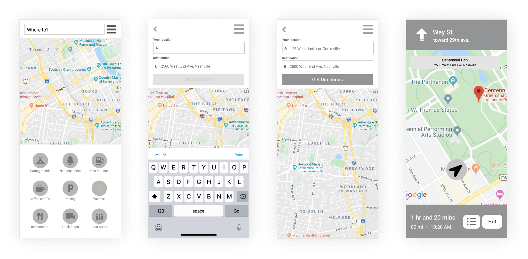
Another roadblock was the implementation of a turn by turn voice navigation was not technologically feasible given the our time frame. To top it all off, we were not going to build a native mobile app but instead, a desktop web app that is mainly used for planning. It was like we went from envisioning to build something like Google maps to building something like map quest.

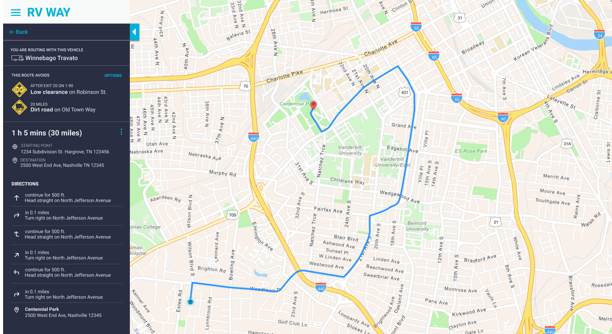
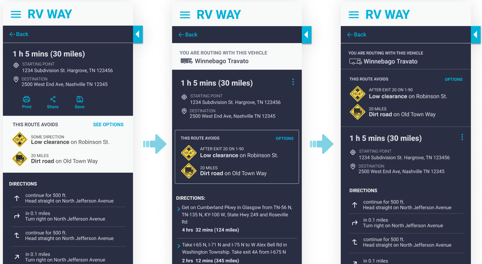
So we shifted our focus back to the core functionality of the app which is navigating the user away from low bridges with their RV’s specifications. We thought of ways on how we can improve the existing experience and really address the user’s painpoint which is safety.

We also wanted to validate if users will use this navigation app for planning their routes ahead. We had doubts if users will even use a navigation app if it doesn’t have a guided voice prompt, so in our succeeding surveys and interviews we included the question:

We also wanted to validate if there was still a use-case for a navigation app that is mainly used for planning. We had doubts if users will even use a navigation app if it doesn’t have a guided voice prompt, so in our succeeding surveys and interviews we included the question:

“When using a navigation app, is turn by turn voice navigation a necessity to your routing experience?”

YES

60%

NO

40%

There really wasn’t a huge gap between the people who said YES and NO. But when we looked at the qualitative data, a common response was that proper planning is key to a safe and successful RV trip. A seasoned RV driver will take the time to plan before a big trip. They would decide on what roads and highways to take, where to get gas, stop for the night and so on. Tips like using a checklist document for all essential supplies is also one of the planning tools being utilized in the RV communities on Facebook. Therefore we assumed that there was a use case for it.

Design Iterations

We made the user interface more intuitive and easy to use by designing a clean and simple look since our average demographic is older, who might not be tech-savvy. We also used a more conversational language and avoided jargon and labels that might be confusing. And to save on production time, the redesigned sidebar requires none to minimal refactoring when converted to mobile.

Having users set up and save their vehicle profile is a crucial part of generating a route that is custom to their RVs. On the add a vehicle form, we fixed how the labels and fields are laid out in a much clearer format.

The directions page has several sections that shows similar information that you would see on Google maps but one important section is the part that shows where the low bridges are and letting the user know that their RV is being routed away from low clearances, dirt roads or steep grades.

Usability testing

After conducting usability testing, we did some iteration based on our users feedback.

The hamburger menu

This was a surprising discovery for us and one that we didn’t really expect. It was a typical case of “you are not your user.” For the internet savvy generation, this might be a typical element of interaction but for our demographic, it was an unfamiliar symbol. The first symbol that we used was not the usual bread-meat-bread hamburger menu. We found that our users didn’t really know what the symbol meant. It also kind of looked like a logo so they didn’t know to click on it that‘s why we went back to the typical equal horizontal lines.

Vehicle interaction

Instead of showing just a list of the name of the vehicles that the user would need to click for them to see the details, we designed an interaction where all the details can be shown and hidden by expanding/collapsing each vehicle without going to another page.

Directions page

To help users remember what vehicle that they are routing with, we added some sort of breadcrumb so they can see the vehicle they are using for that route. It was also important to show the obstacles that are being avoided like low clearances and dirt roads so that the user is aware of the value they get when they use the app.

Learnings and takeaways

You are not your users.

When in doubt about how much the user will understand something or care about a certain feature, get their feedback and validate ideas. We would initialy rely on our assumptions but without validation from users, we might end up with a product that users are not gonna love or worse, not use at all. Users will always have a different perspective of what is useful and what is not.

“Waiting too long to get that feedback is wasteful”

Getting feedback from teammates, especially the developers is also just as important. I think that if we involved our developers more with the ideation process or if we got feedback early on before we did a ton of work, we would have made informed design decisions because we would know if the solution we were designing can even be implemented or if the resources that are required are available.

“The drive is not always about the destination. The sights in between are just as interesting. There’s lots of help finding where to go, but not the best way to get there in an RV”

This quote from one of our interviewees really stuck with me. Traveling in an RV, like life, (and UX!) is not necessarily about the destination. The journey is just as valuable, and the fastest route is not always the best option. There’s something to be said for choosing the road less traveled. You never know what adventures you’ll find along the way!

Read about my other case studies